

PROJECT DURATION
3 Months
CLIENT
Crave
ROLE
Product Designer
YEAR
2020
INDUSTRY
Food-tech, SMB SaaS
MY ROLE & RESPONSIBILITIES
End-to-end UX design, interaction design, UX research (behavioral analysis), responsive web interface design, and design system development to support scalable ordering and cross-vendor experiences.
WORKED WITH
Product Owner (1), Chief Technology Officer(1), Front-end Engineers (2), Back-end Engineers (1)
USERS
A Los Angeles-based marketplace serving three primary pillars: Diners (B2C), Restaurant Operators (B2B), and Venue Managers (SaaS).
GOAL
Design a zero-friction web ordering platform that enables diners to browse menus and place orders without app downloads, increasing engagement for small business partners.
CONSTRAINTS
Multi-vendor complexity, varied user technical literacy (diners vs operators), legacy UI patterns, and mobile-first usability requirements.
RESULTS
Increased session engagement by ~70% (Hotjar, GA).
~60% increase in vendor engagement vs legacy system.
Enabled app-less ordering with scalable, modular UI.
Improved engagement in complex multi-vendor environments.
Target: Small Business Vendor
Target: Food Hall and Hotel Business
Challenge
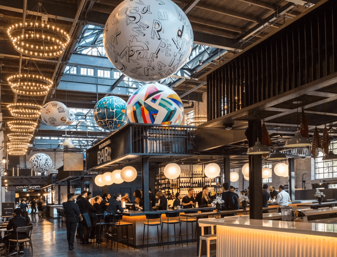
During COVID-19, small restaurants and multi-venue food halls needed a lightweight, customizable way to manage high-volume orders without physical contact.
Solution
1. Targeted Flexibility: Designed distinct web app frameworks for both individual vendors and complex multi-restaurant venues (hotels/food halls).
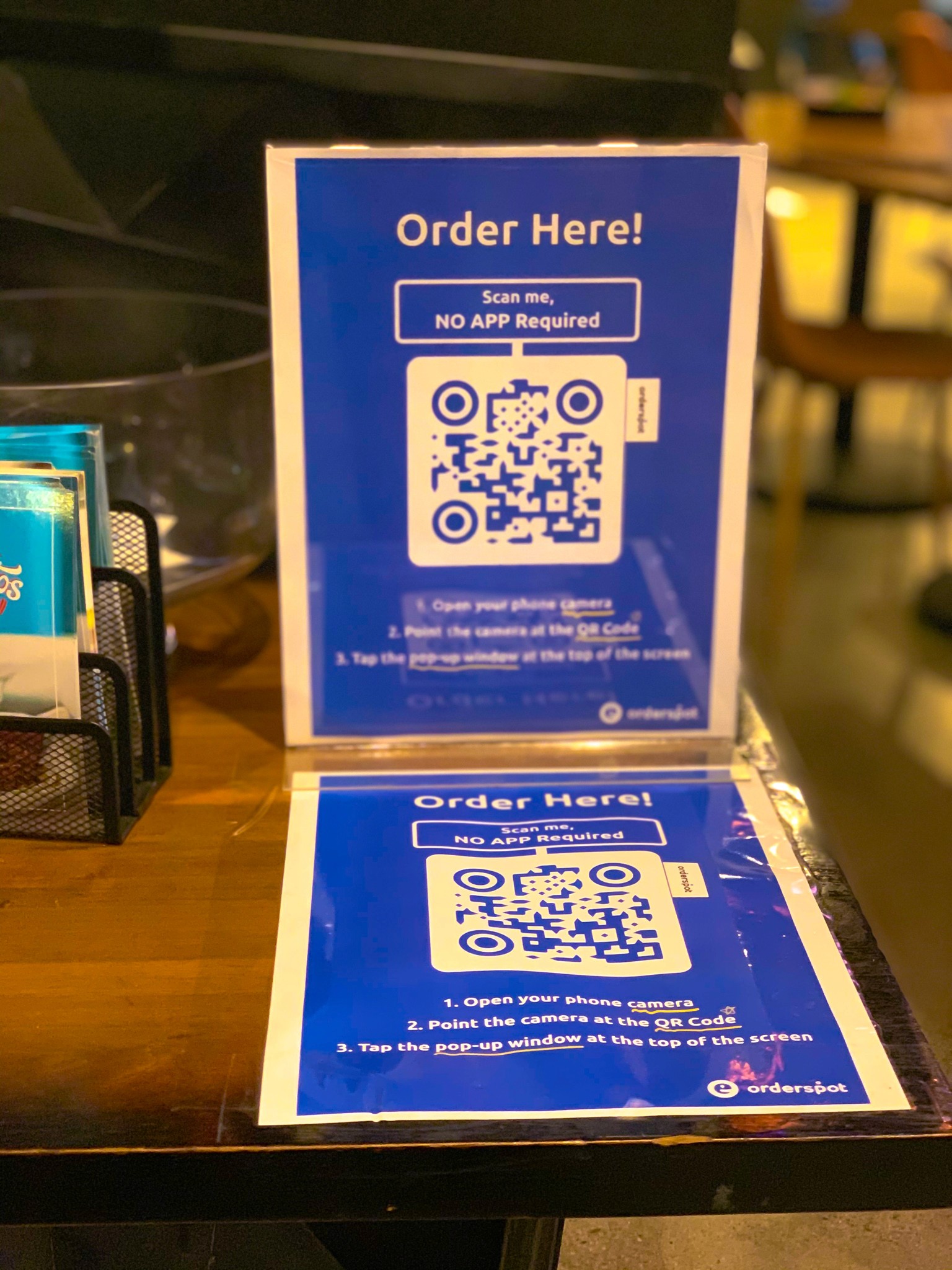
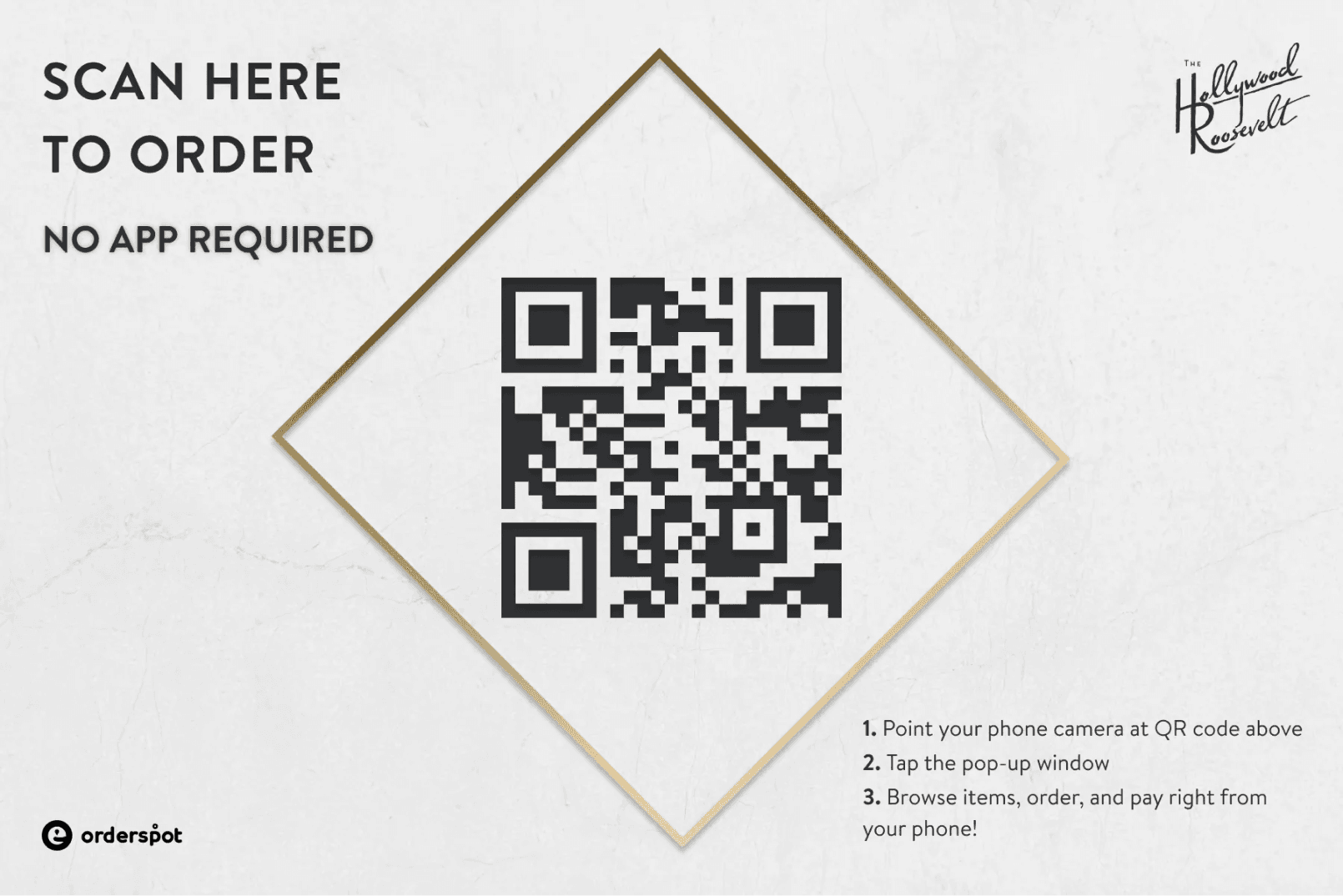
2. Operational Efficiency: Implemented a seamless QR-scanning flow that allows customers to browse, customize, and pay directly from their table.
3. Customization Engine: Built comprehensive branding tools so each restaurant could adapt the UI to their unique aesthetic and menu needs.
Key User Problems Identified: Phase 1

Analyze from Hotjar heatmaps
Forced, disruptive onboarding flow preventing immediate menu exploration
1. Analyze Hotjar Heatmaps and session recordings
2. dentify user's primary intent(menu exploration)
3. Eliminate barriers to immediate menu access
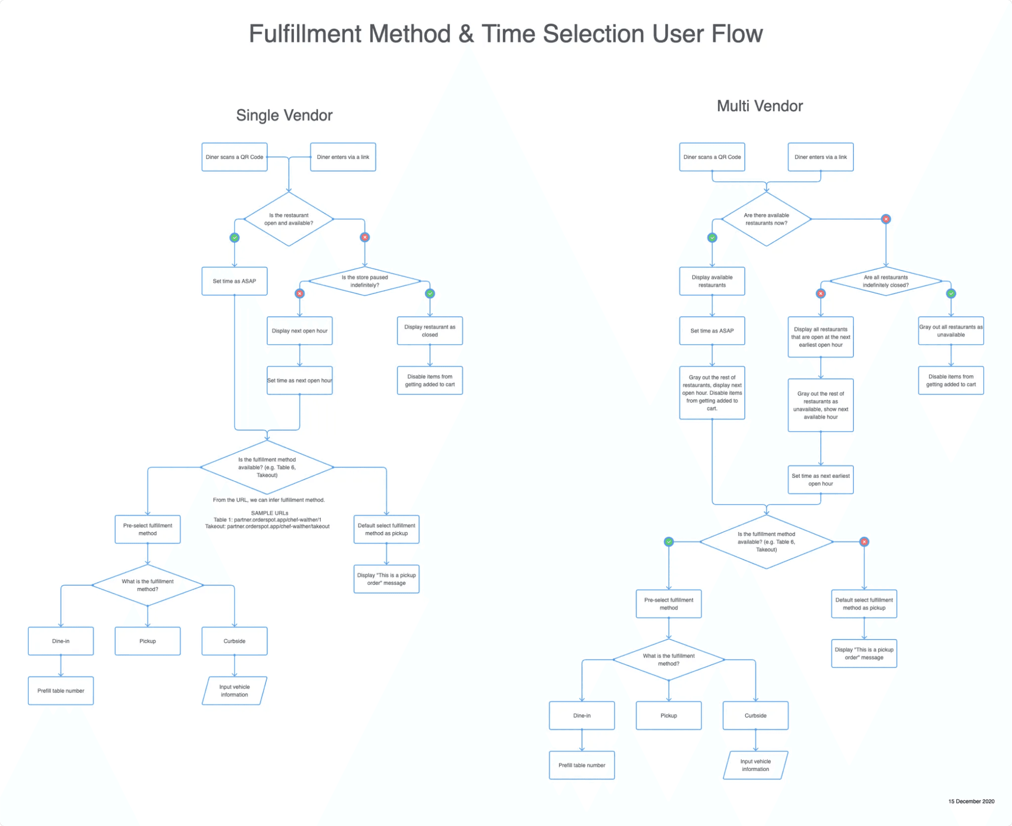
UI Problem: Phase 2
What problems did Crave's UI design have?
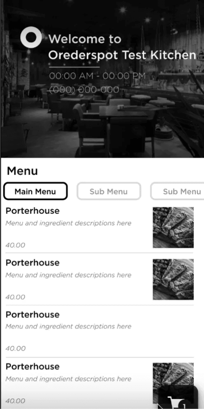
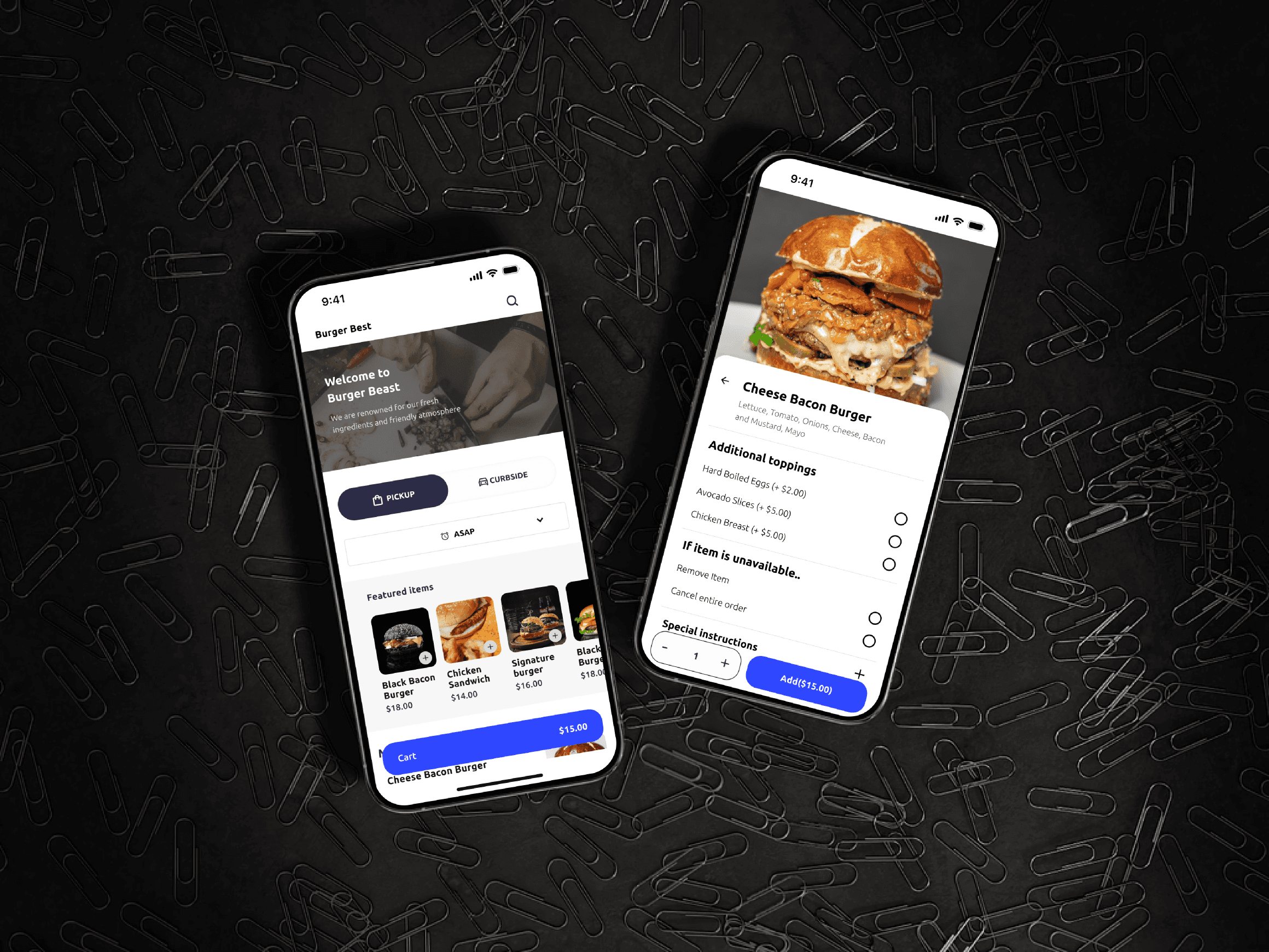
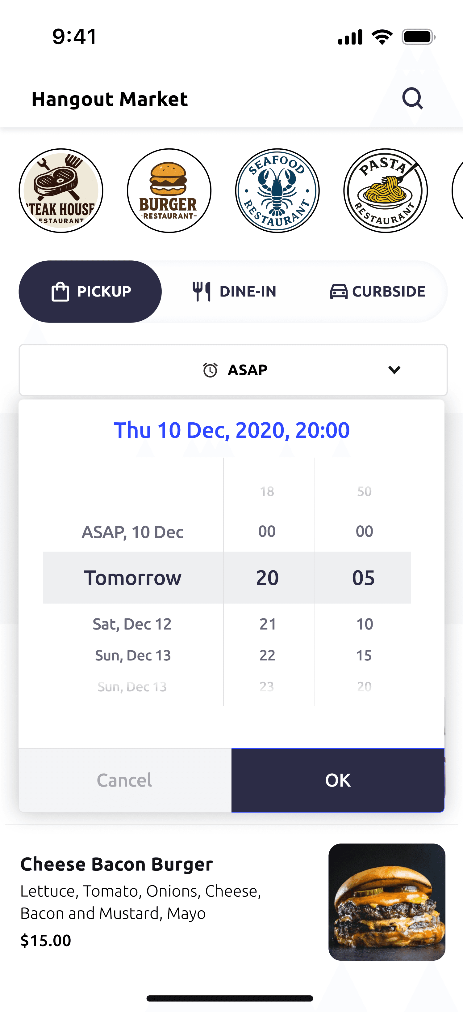
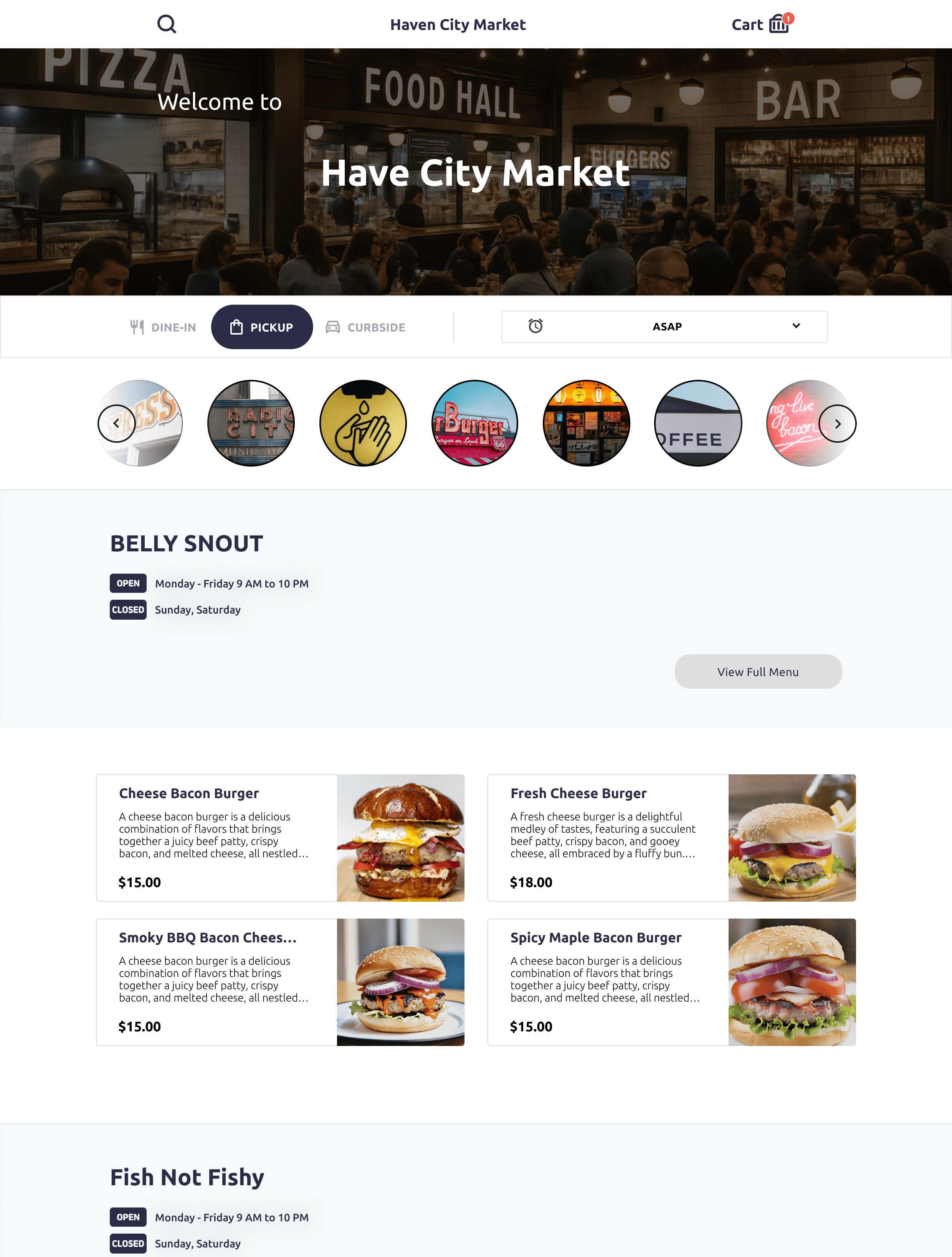
Main Page
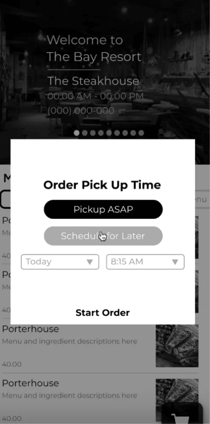
Pick Up Time Setup
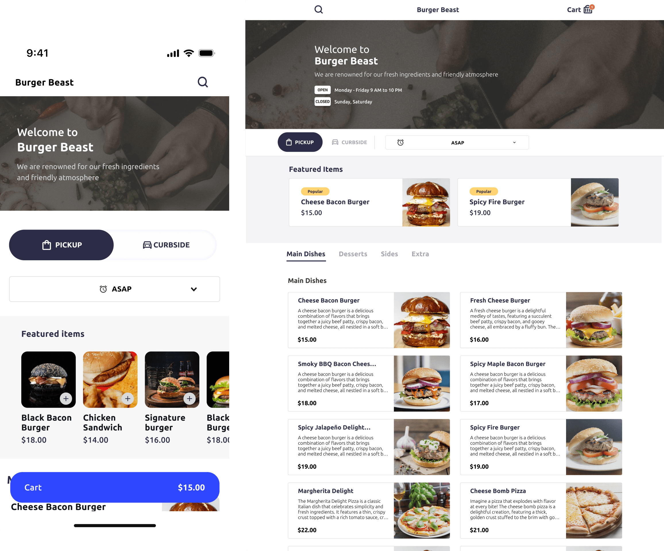
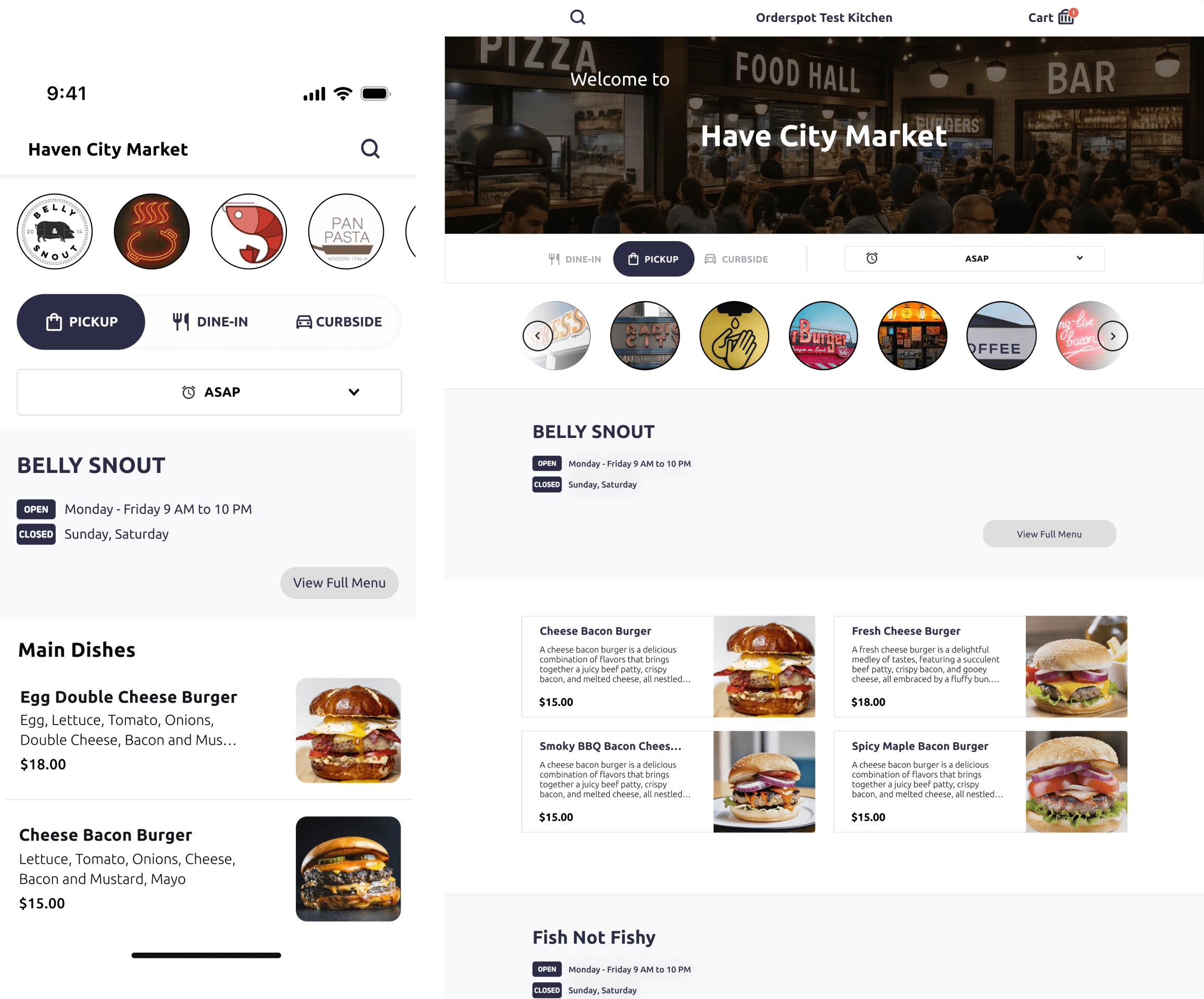
The early product was built without a unified design system, leading to inconsistent and unclear UI across key screens.
Pickup times, menu listings, and item customization each used different patterns, which confused users, slowed down ordering, and weakened the overall brand experience.
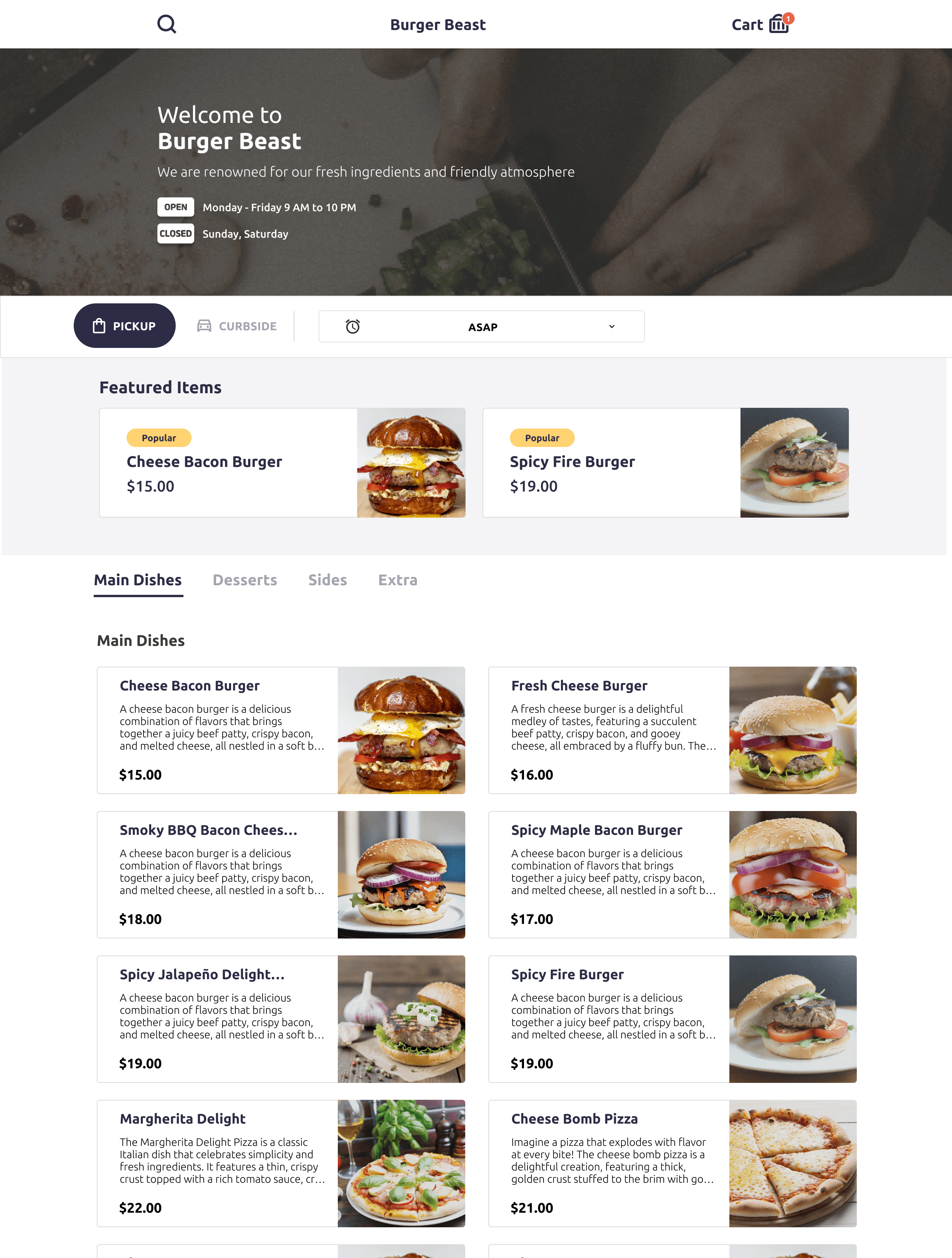
Create a modular, scalable design system with
ᐧ Clear visual hierarchy
ᐧ Consistent colour palettes
ᐧ Standardized typography
ᐧ Adaptive component states (default, hover, active, disabled)
ᐧ Accessibility-focused design
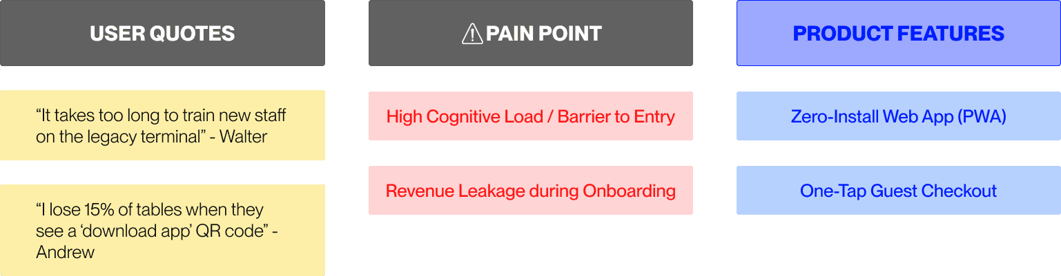
User Interview: Phase 3
Insight-to-Action Matrix
Synthesizing stakeholder interviews into a concrete product roadmap for the MVP.
User Journey Comparison
Streamlining the order lifecycle by removing high-friction manual entry points.
01.
Waiter takes order on paper pad
02.
Manual entry into POS Terminal
Risk: Transcribing error
03.
Order sent to kitchen printer
01.
Diner scans QR (Browser Open)
02.
Direct Checkout & Auto-Pay
Zero manual steps for staff
03.
Cloud-sync to Kitchen KDS
User Experience Mapping: Phase 4
Solution 1
Solution 2

Solution 3

Solution 4
Takeaway 1
· Learned to adapt for diverse literacy levels, device habits, and ergonomics.
· Built inclusive, adaptable interfaces for broader accessibility.
Takeaway 2
Professional Growth
· Gained end-to-end ownership experience, bridging branding, marketing, and product design.
· Strengthened ability to align design with both business goals and user needs.
Takeaway 3
Challenges & Lessons
· Remote research across time zones revealed the importance of flexible methods.
· Limited in-person testing reinforced the value of scalable, repeatable design systems.